Fly UX
A best-in-class flight booking process for a start-up airline company
A start up airline company, called Fly UX, is looking to get a foothold in the online flight booking market.
Fly UX realises that there is a vast amount of competitor websites and apps, with complicated flight booking processes.
The airline understands the value in building a customer-centric experience, and would like to incorporate great design when creating their own flight booking site.
The task:
Carry out research to find out issues on established websites
Synthesise the research data uncovered in the research process
Create a user-friendly flight booking process (for desktop) based on the research findings

Analysis
During the first stage of the Discovery Phase, I conducted an in-depth review of four best-in-class travel-related apps, to understand the best conventions to follow, what to avoid later in the study and also what problems they are solving for their customer.
Specifically, I wanted to learn more about the following four key components on each of my chosen websites: Homepage, Search & Select, Booking, Payment.
I always consider Competitive Benchmarking a great tool when first approaching a project, especially if access to users is limited: you can gather lots of insights from other companies and their products.
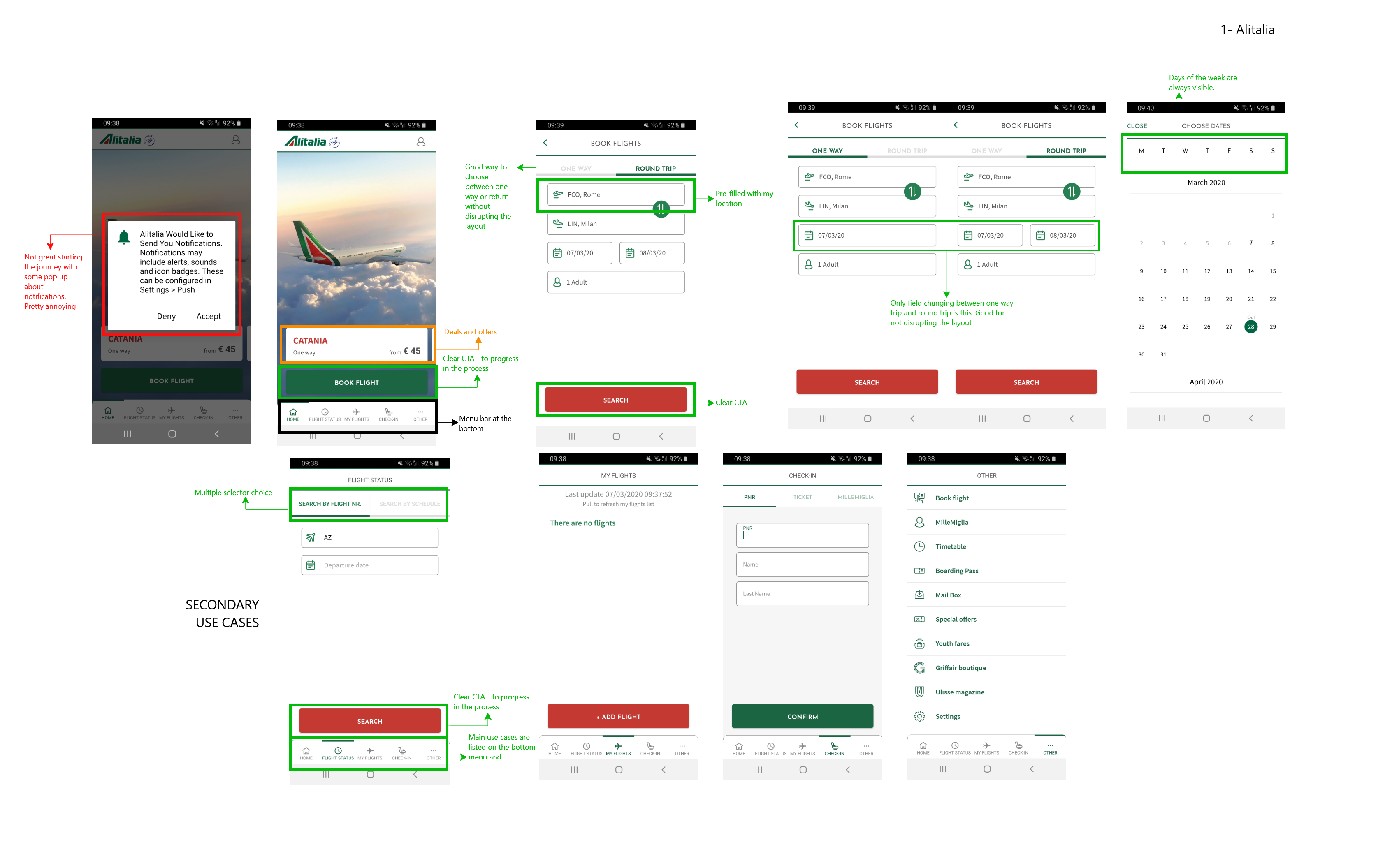
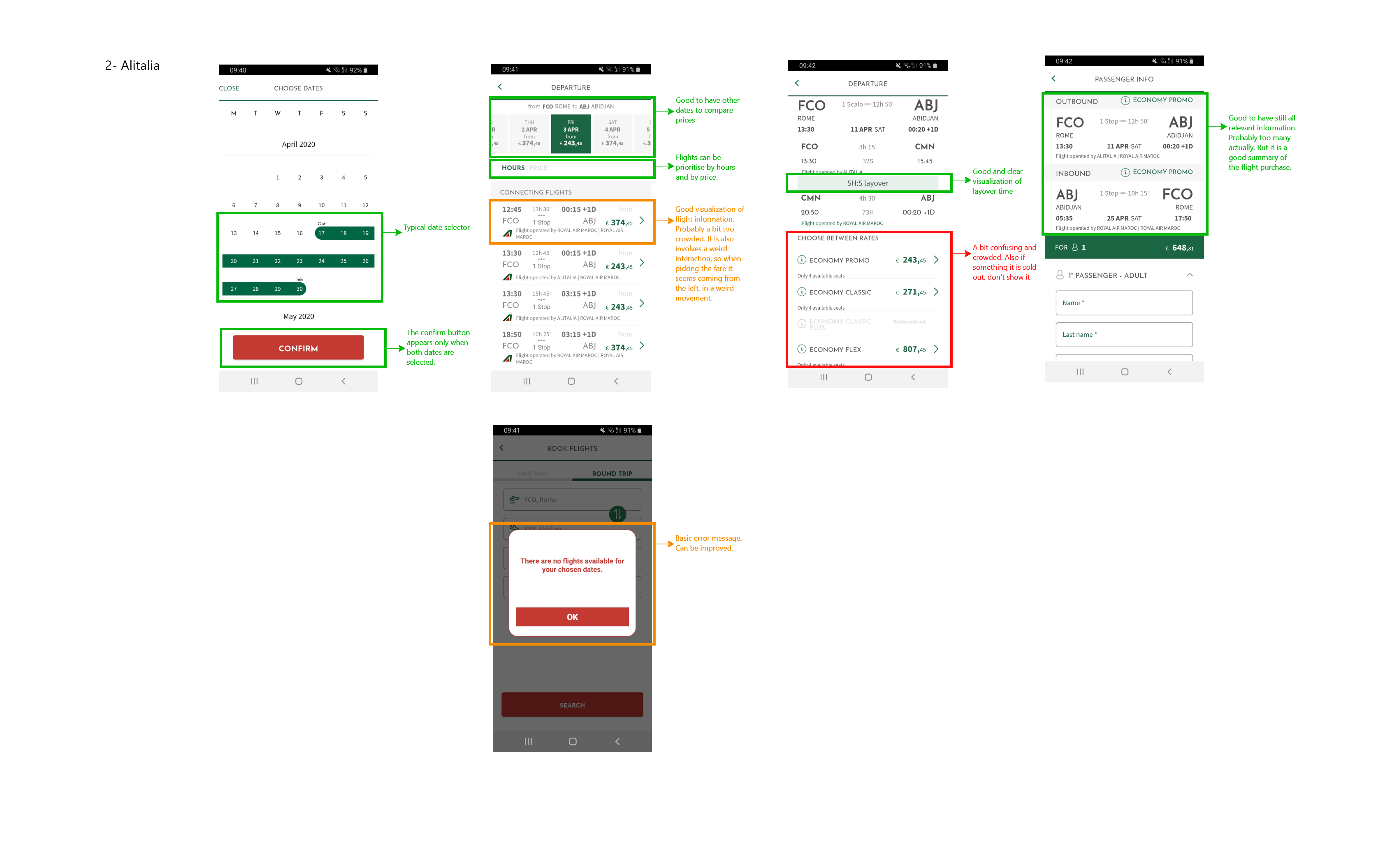
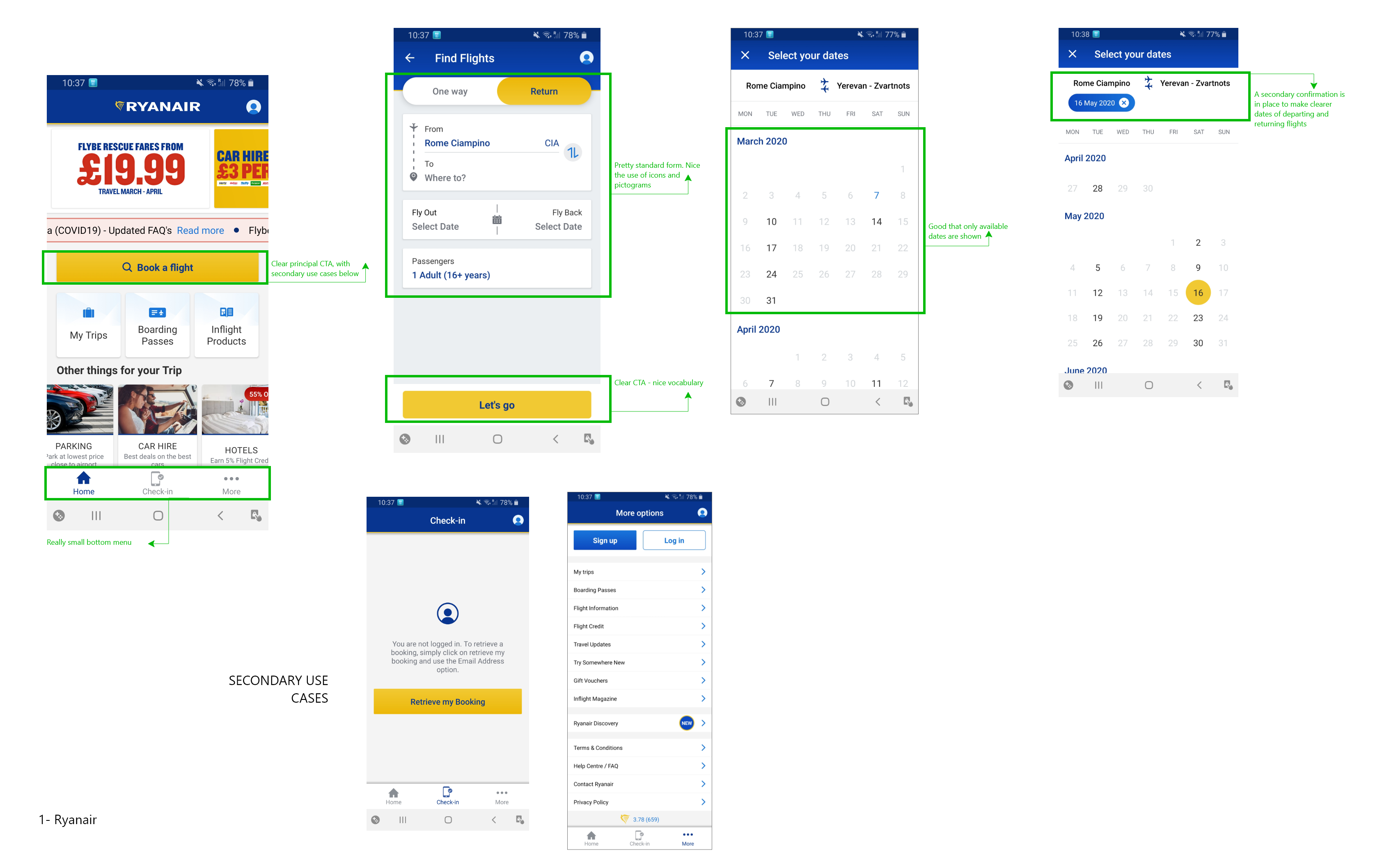
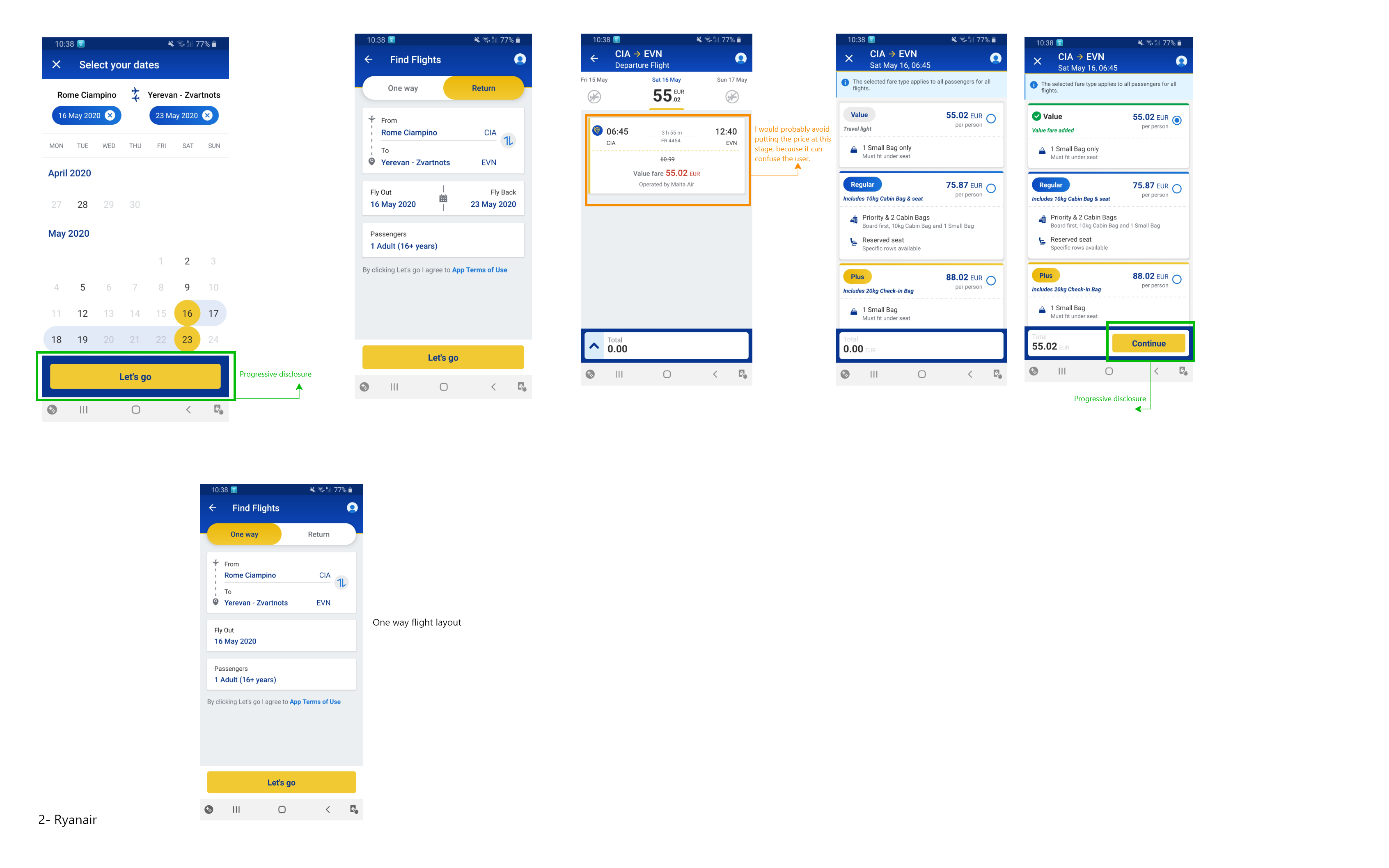
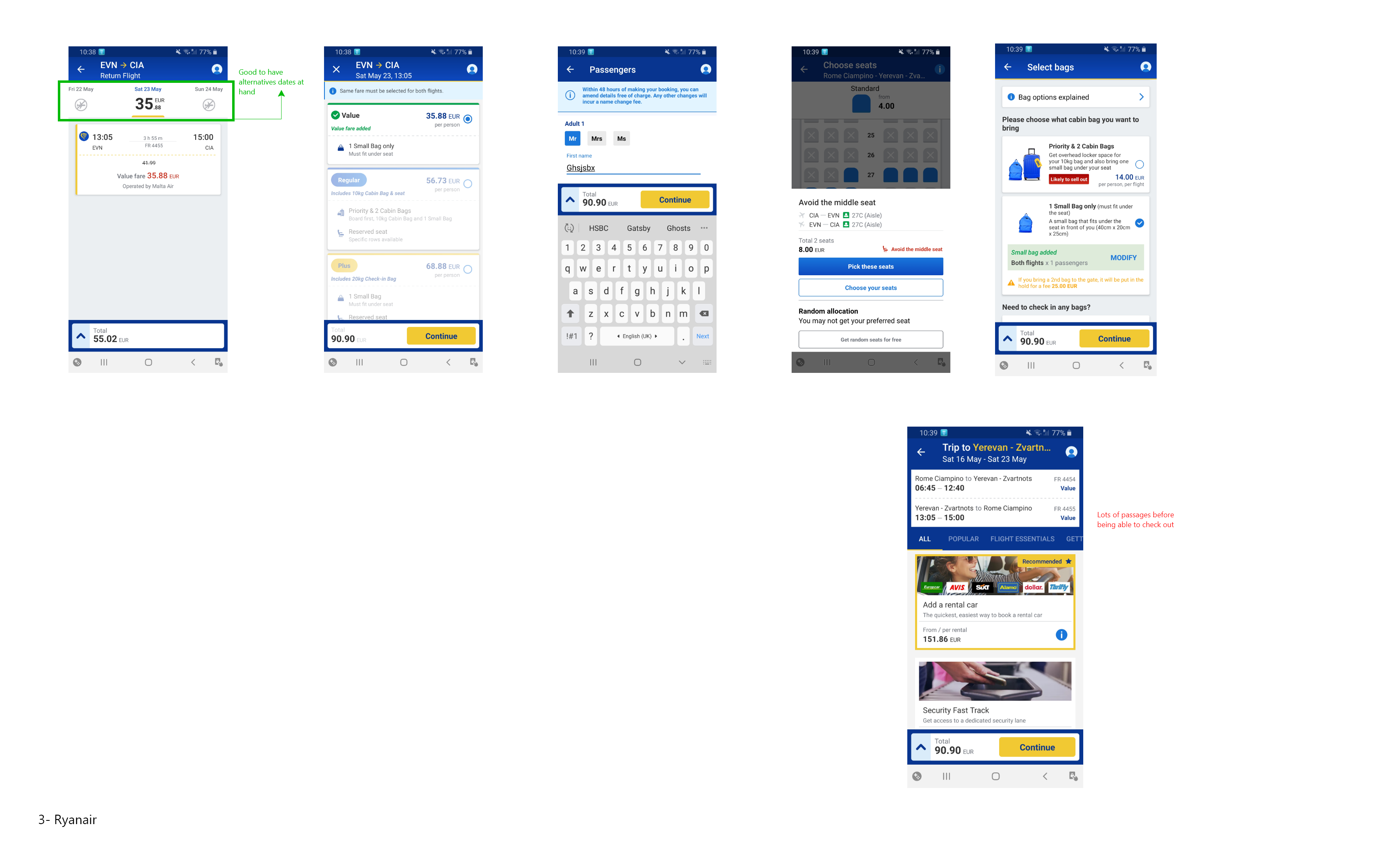
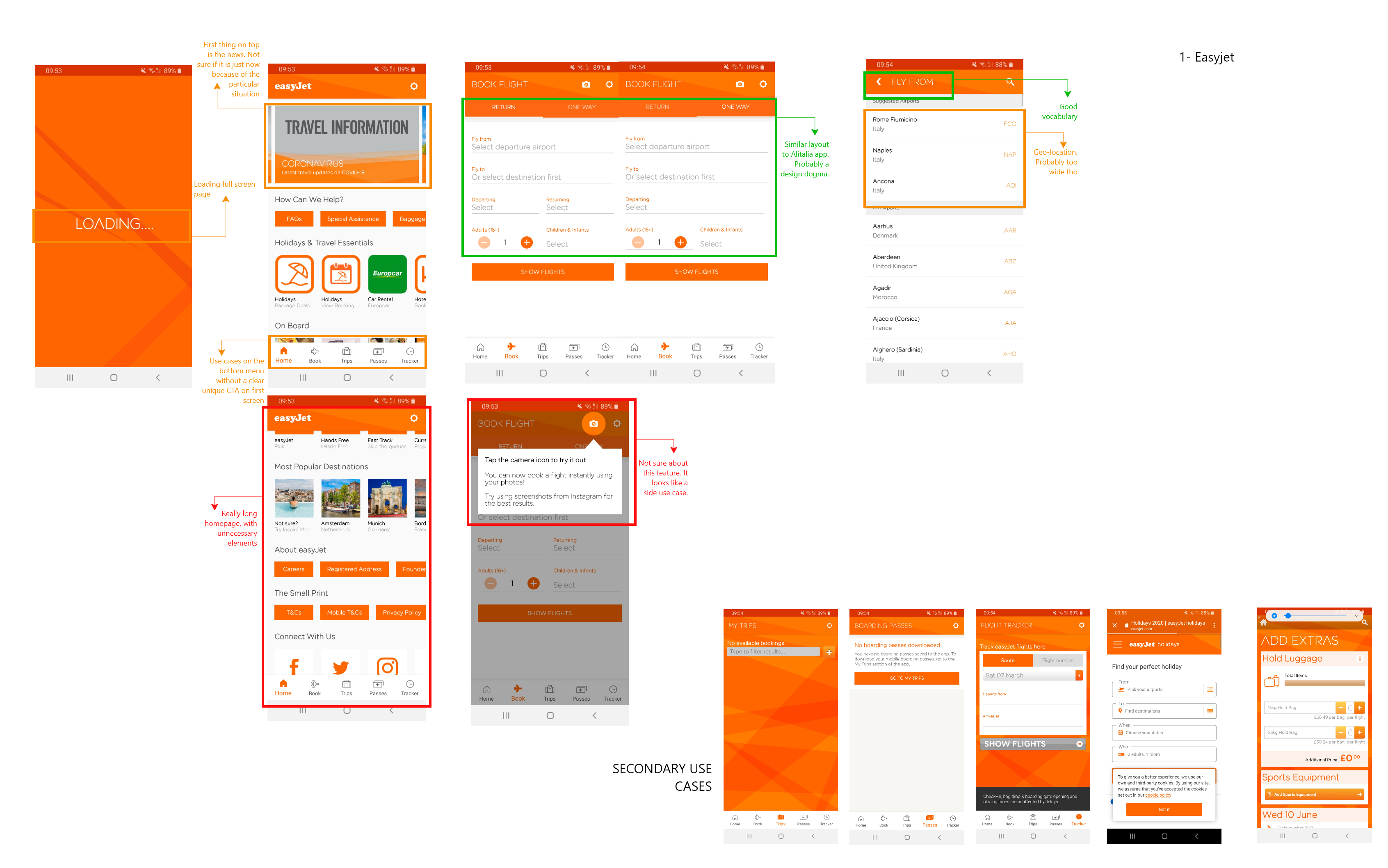
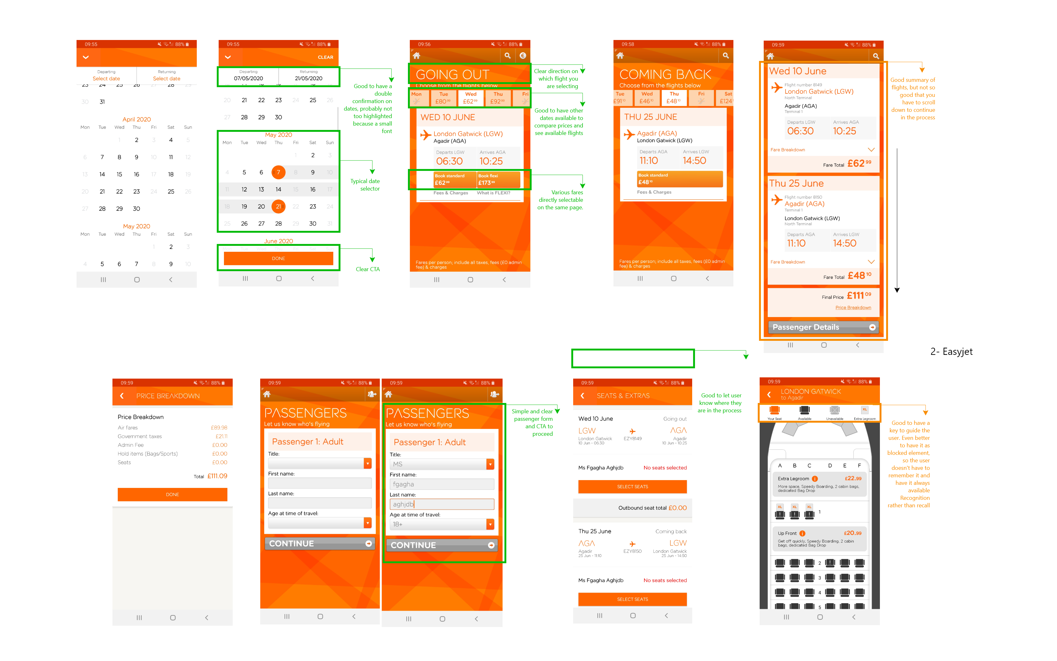
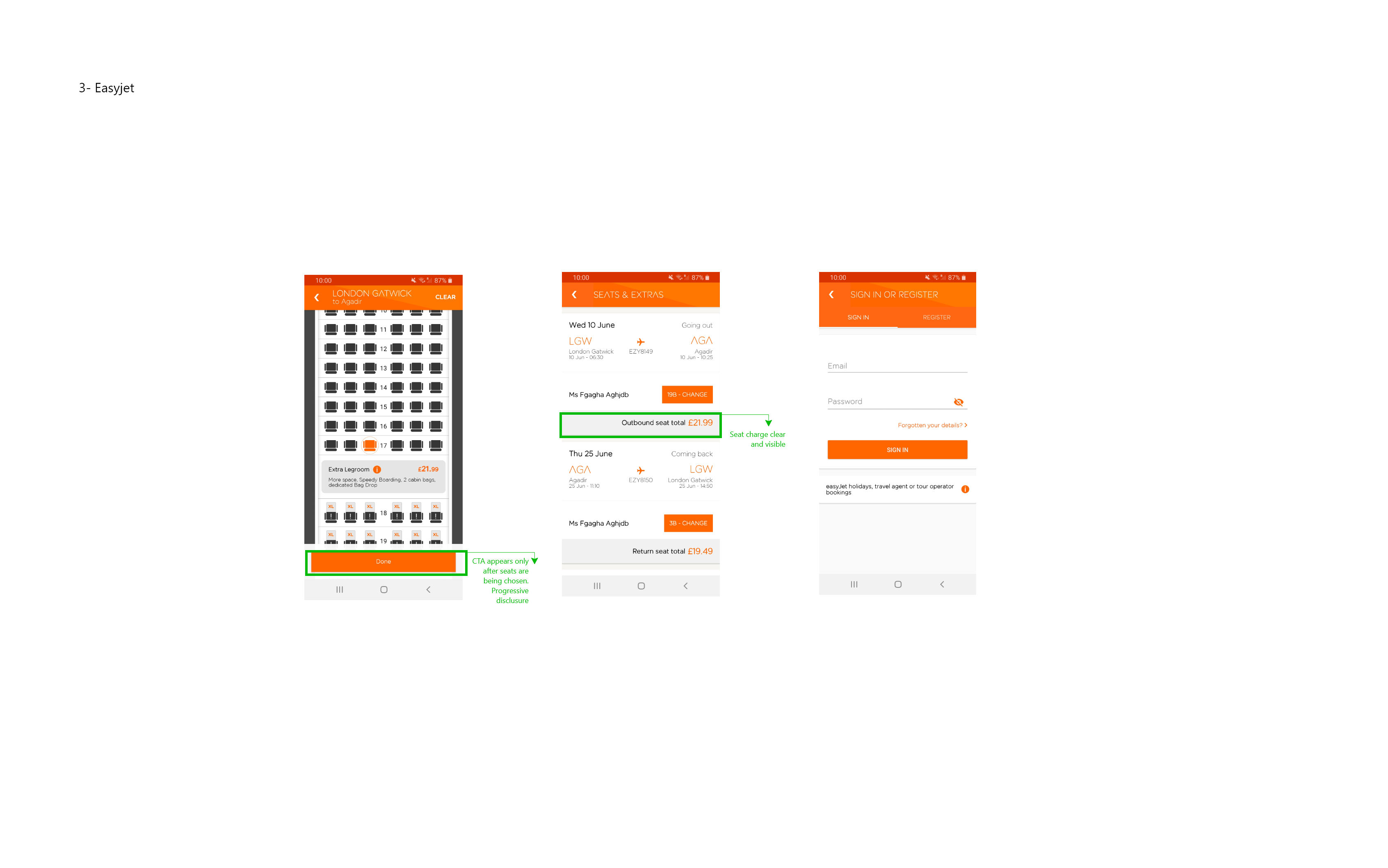
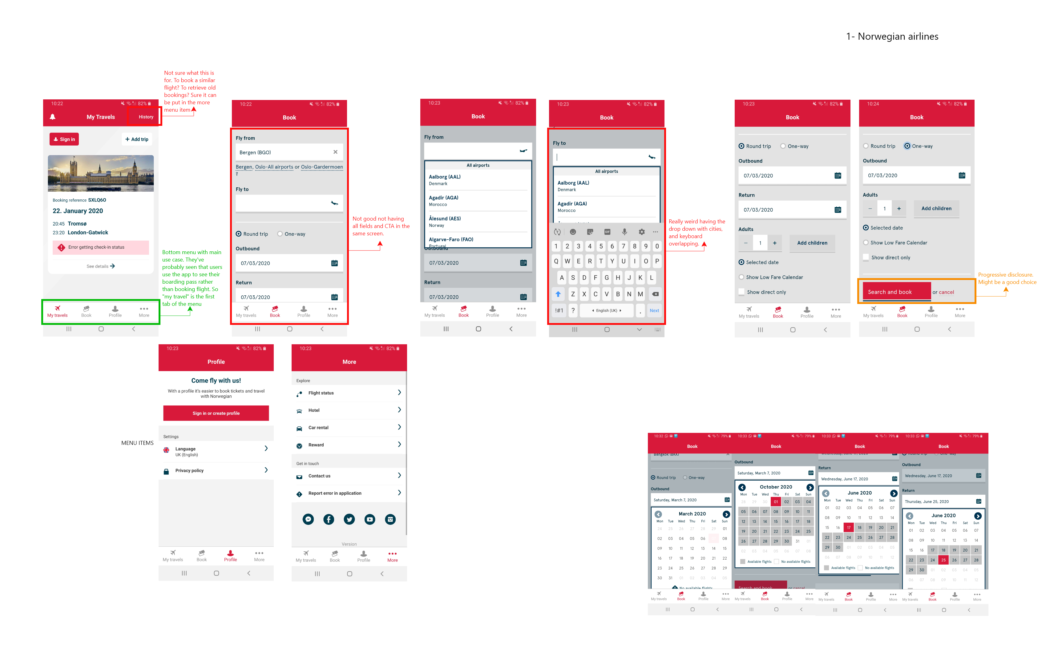
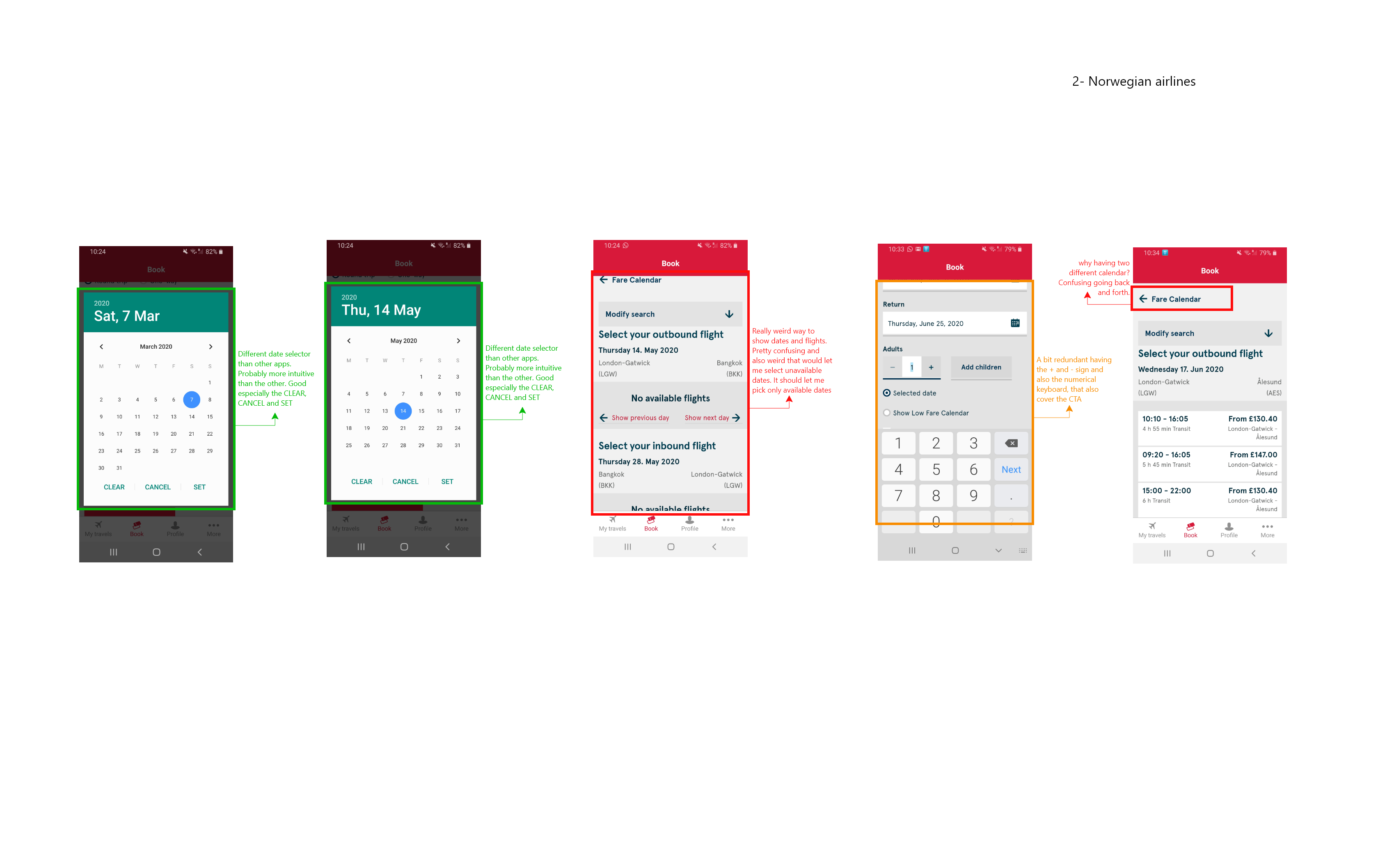
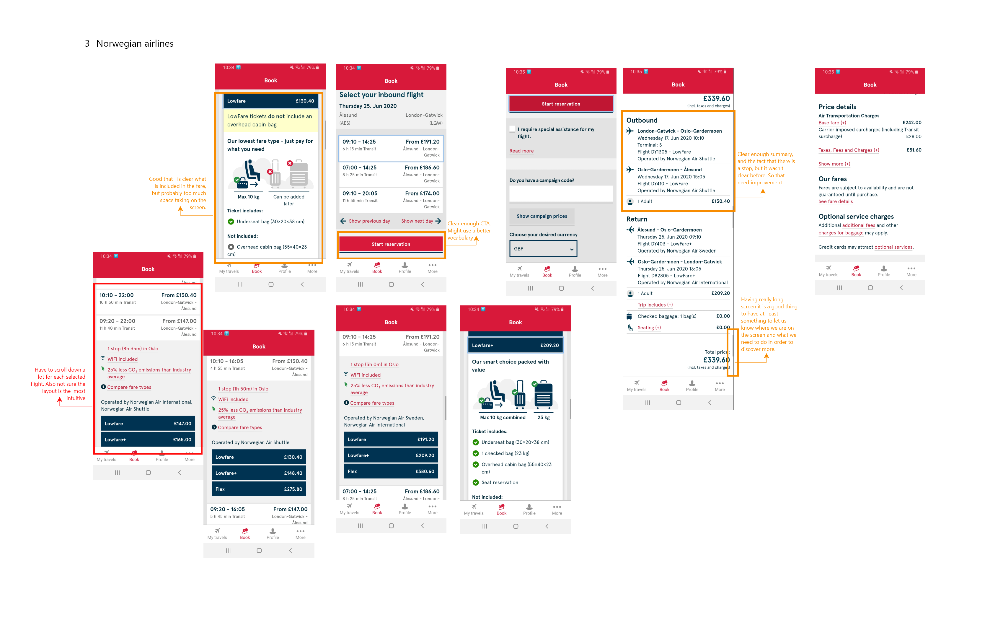
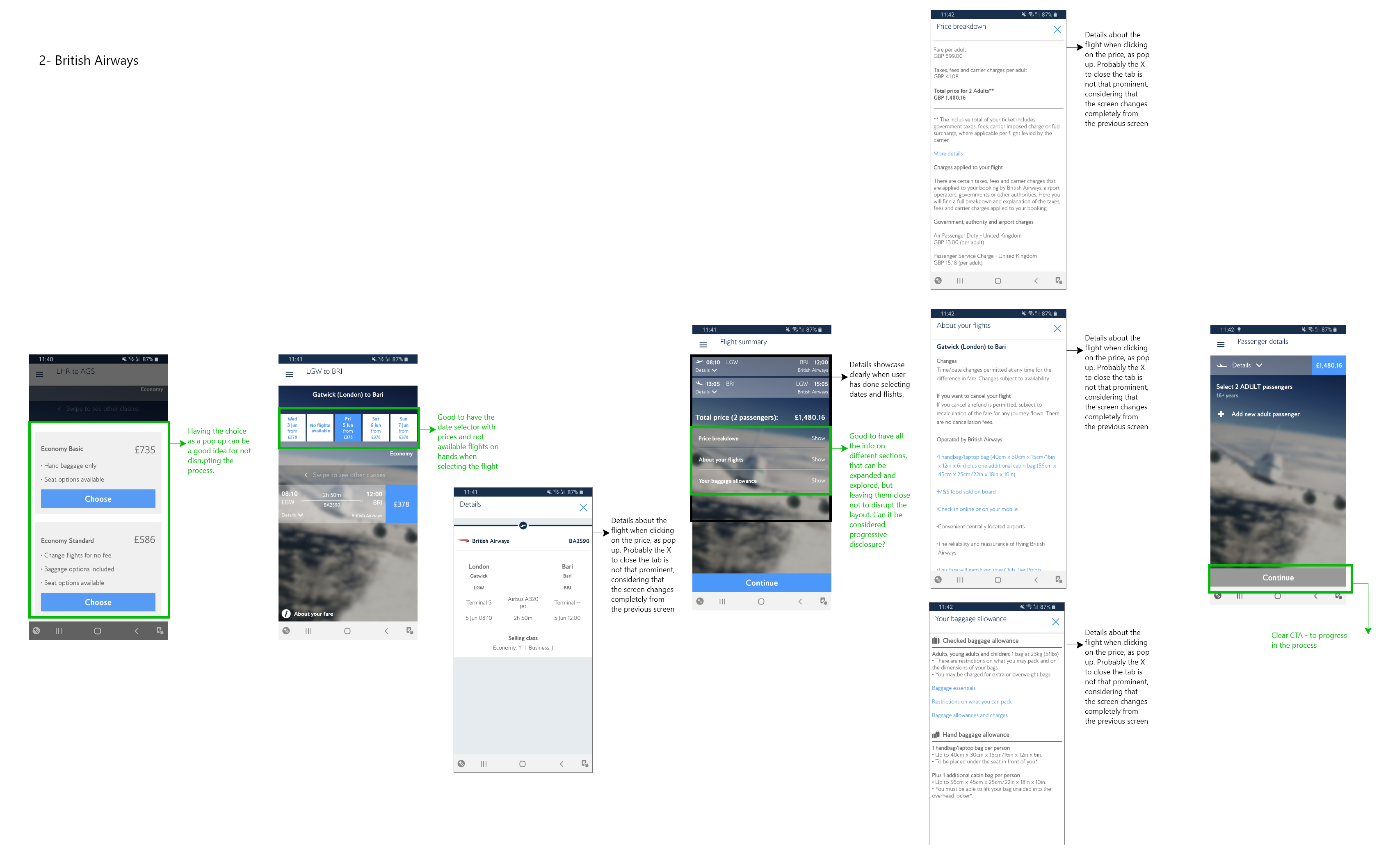

Main takeaways from this analysis
ENABLED LOCATION TRACKING
Location tracking can help reduce friction. In this case, when location tracking was enable the app would set the departure airport to the closest to my position, and would suggest others in the same city if there were any. This would save me time and actually show me that the app is trying to make my life easier.
CITY NAMES AND NOT CODES
Because of the limited space, some apps tend to only showcase the Airport code instead of the City, and this would tend to confuse the user. Instead, a well designed interface should allow for both, the City name and the airport code, giving less importance to the latter.
AVAILABLE DATES & OPTIONS
Some of the apps I analysed would let me pick any date from the calendar only to tell me, after I selected both dates that there were no flights available. This was very frustrating and easily avoidable, by just showing the available dates and also including options at the top of the screen to check different dates and different rates.
After the Competitive Benchmarck, to learn about the goals of people that are using airline websites and apps, I conducted an Online Survey using Google Form.
I also wanted to answer to the following questions:
- What is the user trying to do?
- What (if anything) is preventing them from doing it?
- What else would they like to be able to do on airline websites & apps?
The information gathered during my previous project helped to determine the questions in this online survey.


Insights from the online survey
MOST PEOPLE COMPARE PRICES
Most of the answers about the reason they consulted the airline website or app was around price comparison and evaluating what to book. This consolidated the insight from the competitors benchmark research, that users need to see options to easily decide which option works best for them.
MOST COULD COMPLETE THE TASK
Most of the respondents to the survey were able to complete the task, when asked about the reasons for failure they responded the process was too complex, which probably meant that the product didn’t align enough with their mental model.
PEOPLE BOOK FLIGHTS ON WEBSITES
The majority of the respondent said that they book flights from the airline website and not the app. But when asked about the airlines app the percentage between booking a flight, checking into a flight and using it as a bording pass was the same, meaning the airline app has more use cases than the airline website.
During this next project, I conducted and recorded a usability test to help define the scope and objectives of the case study further.
I recruited a colleague I know was a frequent user of airline apps to help me learn more about people that use airlines apps.
I prepared a script in advance of the usability test – to conduct a comparative test on two different airline websites.
In my test script, I followed the three stage structure – an introduction, an interview and a usability test on each of my chosen airline apps.

Insights from the user interview
SCRIPT IS FLEXIBLE
During the interview I tried to follow the script, but noticed that some of the questions were already being aswered during conversation, or some other different questions rose trhoughtout the interview. I allowed myself to deviate from the strictness of the script and used it only as a guide, in order not to loose any juicy insights.
INTERVIEWS ARE PRECIOUS
With only one interviews I gathered way more insights that all the other researches. Interviews and usability tests are unvaluable because they allow you to expand your view and literally put you in someone else’ shoes. Your preconceptions are not in the way and when you listen carefully you can gain a complete new perspective.
Define
Synthesising the insights
As a first step to organise all the data and insights gathered from the research phase I did an affinity diagram.
Firstly, I wrote all the different insights on various post-its, focusing on trying to see patterns and themes. I went through all the insights and transcribed them on the post-its.
After I had all the post-its on the wall I started grouping them, if they seemed to belong into the same category, if the feedback was similar, if the topic was the same, etc.
After a final review of the grouping I named each group, trying to use naming that would define at best the insights into the category.
I’ve found the following category:
- Unavailable info
- Flight screen layout
- Price breakdown
- Upgrades and fares
- Calendar/date selector
- User feelings
- Features
- Seat selector
- Cities/Airport selector
- Screens layout
- Use cases
- Platform preferences


In order to define even better the insights and the research data, alongside trying to get a better understanding of how users would feel using the product I conducted a Customer Journey Map.
Firstly, I planned out my CJM, defining the high level steps of the customer journey, based on my affinity diagram. I documented the user goals, behaviours, pain points for each part of the booking process, the context of use and mental models to further add structure to my research data.
I segmented each stage of the booking process along the top of the page. I then wrote down corresponding notes in each section. It was also useful to review previous research data to be able to add include direct quotes to the CJM.
After finishing my write-up, I assessed whether each of the experiences were positive or negative. I added an overall smiley face to the top of each section to sum up the general feeling of each stage.
Insights from the Customer Journey Map
WHERE TO FOCUS
This kind of research allowed to have a clear view of where I should focus my attention in order to make the experience more enjoyable and see at glance where the pain points are and where users encounter the more or the less friction.
SECTION FLOWS
With this map in hand I was able to refer to particular steps into the user flow. It also allowed me to, more easily, keep the users feelings in mind, a quick glance to the map and I could see if the section I was working on had a positive or negative impact, allowing me to focus on improving the overall experience.
BREAKING DOWN THE PROCESS
Breaking down the booking process made me realise the complexity in each of the stages involved, which allowed me to dig a bit deeper on that while sketching the user flow diagram.
Develop
In the first activity of the Define Phase, I wanted to design a high level flow diagram for the app for a primary use case by creating a user flow diagram.
The overall objective of this project was to address all the issues that were uncovered during my research, highlighted in the customer journey map (CJM) project.
Before sketching the user flow diagram, I referred back to the insights captured in my affinity diagram.
Next, I sketched out my diagram, representing screen with circles, interactions with squares and also adding important behavioural notes for some of the screen.
Once I was happy with the flow, I translated my paper copy into a digital diagram using Adobe XD.

Insights from the flow diagram
MORE COMPLICATED THAN EXPECTED
Laying out the flow diagram step by step gives a visual representation of the booking process. There are many more steps involved than initially anticipated. This process helps ensure all stages have been considered during the booking process.
PRECIOUS DOCUMENT
In future iterations of the case study, the User Flow Diagram would aid with any additions or amendments, which could potentially include mapping out further use cases.
DEALING WITH STAKEHOLDERS
Flow Diagrams can help other team members and stakeholders be able to understand your vision. It is also a great way to act as an indicator to show where you are in the process.
For the next step of the develop part I translated each step of the flow diagram into screen with a low fidelity wireframe. For this part I started with pen and paper, so I was able to easily fix any part that were missing or that needed to be taken off.
After having defined the screens sketches into paper I took pictures and used the images as guide for the digital version of the low fidelity wireframe.
For the digital version I used Adobe XD. I didn’t focus too much on rules or the UI for this stage, since I needed it as a testing prototype as next step.


In order to test my design I took the screens from the low-fidelity wireframe and proceed to connect them into a clickable prototype using Adobe XD. This allowed me to have a separated link I could send to people, which was essential, since when I completed this task the UK were in full lockdown.
I was able to complete one usability test in person, and 3 more sending the link to friends, and then asking them to share their screen so I could see what they were doing. I always kept in mind, during these tests that the experience was slightly different from the actual one because of the different platform. They were clicking throught the prototype using their laptop and not directly from their phone as it would be with the actuall app.
Since the main feedback focused on UI aspects of the experience (like not clear enough when fields were inactive or active) I then proceded to define the UI of the app, alongside defyining rules and beahviours of each components.
Deliverables
A high fidelity wireframe with different screen states, rules and a complete UI.


